I have been developing a tool that processes timetable data and would like some advice on how to develop the graphical output. I do intend to keep the data in excel, but would like to output to a different software package for the graphical output. Something that reads the excel data and outputs a nice graph that is embedded in the spreadsheet. If not an off the shelf package then I will build something bespoke, but also do not know which language would be best suited and fastest to learn sufficiently for the task.
I note that there are several off the shelf software packages that can be used for this purpose, for example Tableau, amcharts, D3.JS, Flot, Highcharts, and i am sure many more, but is there anything that is specifically designed for the task i have in m ind? I.e. using excel data and being embedded in the spreadsheet?
If not, perhaps I should learn a language or framework to build it on? If anyone has any experience with any off the shelf software packages that would do the job (and be quicker and easier to learn) or would recommend my dedicating some time to picking up enough python or R or other language, please advise.
It is important to point out that I have built a dynamic model, a tool. The user will have no understanding of excel and will have no opportunity to interact with the data except by selecting the files to upload, and through controls on the user interface. As such, as far as i can tell, power pivot and power Bi are not appropriate. This will be a stand alone app that has fixed functions.
I am not sure, but i think it is not possible to create graphs with sufficient flexibility with Excel. Perhaps it is with VBA.
Either way, I am going to have to learn something new to develop graphical output based on the data that the spreadsheet can now output.
I will attempt to explain all of the features the software or bespoke script will need to do. Mostly this comes down to being able to change with the data ranges.
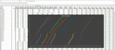
I have attempted to do this with excel. Please see attached image.
The series are in 3 categories: Bus Leg1, Bus Leg2 and Train. The total number of series and number of series in each category changes depending on the files input. I would like to be able to control the colour by category (row 1). Not sure if this can be done. Its hard enough just select the series and get three matching colours in excel, as you can see. (FAIL!)
There are 27 stops (Y Axis), again, this will vary (up to 250). Excel can handle this. But I would like to be able to show names on Y Axis, not numbers. I have seen various examples of how to do this, but not for line graphs, and not for this type of data.
The start time (x axis) is also variable. I don't think Excel can handle this as you have to define the axis in the chart with constants.
Additionally, this line graph will just be one of several graphs that the user will be able to chose from. I will also provide data on each stop on the given route, preferably represented in bubble charts.
I realise I have a bit of a learning curve ahead of me, but am hesitant to start on the wrong one! I am thinking of doing it with Python. Maybe?
I suppose it could be done pretty easily with JS but that might be hard to learn. And maybe R? Perhaps excel can do it with sufficient VBA? Or any of these off the shelf products may be sufficient for my purposes. does anyone have any experience of them?
Any advice very welcome, thanks.
I note that there are several off the shelf software packages that can be used for this purpose, for example Tableau, amcharts, D3.JS, Flot, Highcharts, and i am sure many more, but is there anything that is specifically designed for the task i have in m ind? I.e. using excel data and being embedded in the spreadsheet?
If not, perhaps I should learn a language or framework to build it on? If anyone has any experience with any off the shelf software packages that would do the job (and be quicker and easier to learn) or would recommend my dedicating some time to picking up enough python or R or other language, please advise.
It is important to point out that I have built a dynamic model, a tool. The user will have no understanding of excel and will have no opportunity to interact with the data except by selecting the files to upload, and through controls on the user interface. As such, as far as i can tell, power pivot and power Bi are not appropriate. This will be a stand alone app that has fixed functions.
I am not sure, but i think it is not possible to create graphs with sufficient flexibility with Excel. Perhaps it is with VBA.
Either way, I am going to have to learn something new to develop graphical output based on the data that the spreadsheet can now output.
I will attempt to explain all of the features the software or bespoke script will need to do. Mostly this comes down to being able to change with the data ranges.
I have attempted to do this with excel. Please see attached image.
The series are in 3 categories: Bus Leg1, Bus Leg2 and Train. The total number of series and number of series in each category changes depending on the files input. I would like to be able to control the colour by category (row 1). Not sure if this can be done. Its hard enough just select the series and get three matching colours in excel, as you can see. (FAIL!)
There are 27 stops (Y Axis), again, this will vary (up to 250). Excel can handle this. But I would like to be able to show names on Y Axis, not numbers. I have seen various examples of how to do this, but not for line graphs, and not for this type of data.
The start time (x axis) is also variable. I don't think Excel can handle this as you have to define the axis in the chart with constants.
Additionally, this line graph will just be one of several graphs that the user will be able to chose from. I will also provide data on each stop on the given route, preferably represented in bubble charts.
I realise I have a bit of a learning curve ahead of me, but am hesitant to start on the wrong one! I am thinking of doing it with Python. Maybe?
I suppose it could be done pretty easily with JS but that might be hard to learn. And maybe R? Perhaps excel can do it with sufficient VBA? Or any of these off the shelf products may be sufficient for my purposes. does anyone have any experience of them?
Any advice very welcome, thanks.