Design Ideas

Ian

Administrator
Joined
Feb 23, 2002
Messages
19,883
Reaction score
1,514
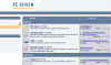
I've come up with a possible design idea, one using the current colour scheme, and another a bit brighter... The designs are VERY fast loading and much lighter.

Please keep in mind that there are very preliminary so don't pay attention to the detail/quality, just the outline.

Let me know what you think, as I'm still considering going ahead with a new design (in time).
 

Attachments

  • Idea2.gif
    Idea2.gif
    19.3 KB · Views: 225
  • Idea3.gif
    Idea3.gif
    18.1 KB · Views: 303
This one :)

If you insist, i kind of like those ones... but a bit more silver for me!

KGB
 

Attachments

  • Image2.webp
    Image2.webp
    92.3 KB · Views: 249
KGB-911 said:
Can you put one of them on so we can have a proper look?
It would take weeks of programming to add a new template, so this is just a quick mockup done in Macromedia Fireworks. I'm working on getting an example up once I get the colours/layout finalised :)

Muckshifter said:
I like the second also ...
Was that the darker coloured one I posted, or KGBs?
 
I was wandering that, but i thin he ment yours...

ohh, i thought it would be a simple "apply new template" like on my forum.
 
can't say i like the new designs more than the current one i'm afraid, and certainly not the brighter one.

It looks far too plain with the increased amounts of white.

sorry :(
 
christopherpostill said:
can't say i like the new designs more than the current one i'm afraid, and certainly not the brighter one.

It looks far too plain with the increased amounts of white.

sorry :(
Thats OK Chris! I'm after everyones opinions before I make any changes! :)
 
THe left one (brighter) gets my vote, the other one just looks too simulaur.
 
Ian Cunningham said:
It would take weeks of programming to add a new template, so this is just a quick mockup done in Macromedia Fireworks. I'm working on getting an example up once I get the colours/layout finalised :)

Was that the darker coloured one I posted, or KGBs?
The darker of the two gets my vote ... ;)
 
My preference is with the darker one, the lighter looks a little..erm...Microsofty ? (May just be me)

I have a preference for darker colours anyway.
 
I've played around with it a little more and come up with this idea, does this look any better?

I'm not in any rush to get a new design up, and I only would if it was a fraction of the file size :) (so far it is!).

attachment.php
 

Attachments

  • PCR.webp
    PCR.webp
    12.8 KB · Views: 262
that one gets my vote :)

There are many reasons... one of them i will let you work out. tell me when you know what one of my reasons are...
 
KGB-911 said:
that one gets my vote :)

There are many reasons... one of them i will let you work out. tell me when you know what one of my reasons are...
Its blue and silver? Ah... the laptop!
 
I like it a lot

... but I still have the misconception that a Laptop is not a PC. :o


The old pic' was fine ... ;)
 
I was going to use a PC again, but I couldn't find one that fitted (I don't have the old image anymore, doh!).

There is a little test site here : https://www.pcreview.co.uk/test which you can use to judge the loading times (bearing in mind that it is just a test and content isn't there!).
 
I like that one, but I prefer the PC at the top (sorry KGB, no offense ;))
 
Back
Top