Conditional Formatting Colour in a Column Graph (Excel 2003)

S

snowbunny00774

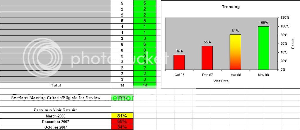
I have created a column graph, and I know I can manually colour the
columns to reflect their values.
I was wondering though if I can get them to automatically colour based
on the values being used
to create the columns
i.e.

a value from 0-79 would result in a red column
a value from 80-99 woudl result in a yellow column
a value of 100 would result in a green column


I've heard it can be done through VB, but unless the instructions were
super detailed for me to follow I would be lost!

Thanks for any help that you can give.
 
B

Bob Phillips

Add helper columns to get values for those ranges, such

C2: =IF(B2<80,B2,NA())
D2: =IF(AND(B2>=80,B2<100),B2,NA())
and so on, copy these down and then chart columns A, C, D etc. This will
give you multiple series and you can colour each series to your preferred
colour.


--
HTH

Bob

(there's no email, no snail mail, but somewhere should be gmail in my addy)
 
S

snowbunny00774

Add helper columns to get values for those ranges, such

C2: =IF(B2<80,B2,NA())
D2: =IF(AND(B2>=80,B2<100),B2,NA())
and so on, copy these down and then chart columns A, C, D etc. This will
give you multiple series and you can colour each series to your preferred
colour.

--
HTH

Bob

(there's no email, no snail mail, but somewhere should be gmail in my addy)


- Show quoted text -

Thanks Bob, I'm a little bit lost ( and a basic excel user) - what
will those formulas do exactly?
Right now I guess I just have one series, and it takes the info from
each cell - there are only 4, that have the numbers in them,
i.e.34, 55, 81, 100.

Should I be doing this another way?
 
S

snowbunny00774

Thanks Bob, I'm a little bit lost ( and a basic excel user) - what
will those formulas do exactly?
Right now I guess I just have one series, and it takes the info from
each cell - there are only 4, that have the numbers in them,
i.e.34, 55, 81, 100.

Should I be doing this another way?- Hide quoted text -

- Show quoted text -

Bob? anyone?
 
J

Jon Peltier

I've written an illustrated tutorial about this technique:

http://peltiertech.com/Excel/Charts/ConditionalChart1.html

I've also blogged about a few VBA approaches, but the formulaic approach
above is preferred.

http://peltiertech.com/WordPress/2008/03/03/vba-conditional-formatting-of-charts-by-value/
http://peltiertech.com/WordPress/2008/03/03/vba-conditional-formatting-of-charts-by-category-label/
http://peltiertech.com/WordPress/2008/03/03/vba-conditional-formatting-of-charts-by-series-name/

- Jon
-------
Jon Peltier, Microsoft Excel MVP
Tutorials and Custom Solutions
Peltier Technical Services, Inc. - http://PeltierTech.com
_______


Add helper columns to get values for those ranges, such

C2: =IF(B2<80,B2,NA())
D2: =IF(AND(B2>=80,B2<100),B2,NA())
and so on, copy these down and then chart columns A, C, D etc. This will
give you multiple series and you can colour each series to your preferred
colour.

--
HTH

Bob

(there's no email, no snail mail, but somewhere should be gmail in my
addy)


- Show quoted text -

Thanks Bob, I'm a little bit lost ( and a basic excel user) - what
will those formulas do exactly?
Right now I guess I just have one series, and it takes the info from
each cell - there are only 4, that have the numbers in them,
i.e.34, 55, 81, 100.

Should I be doing this another way?
 
B

Bob Phillips

They create a column of values or #N/A depending upon the actual value. You
then chart these columns not the original ones.

--
HTH

Bob

(there's no email, no snail mail, but somewhere should be gmail in my addy)

Thanks Bob, I'm a little bit lost ( and a basic excel user) - what
will those formulas do exactly?
Right now I guess I just have one series, and it takes the info from
each cell - there are only 4, that have the numbers in them,
i.e.34, 55, 81, 100.

Should I be doing this another way?- Hide quoted text -

- Show quoted text -

Bob? anyone?
 
S

snowbunny00774

Jon, I'd found your blog before and because I'm a VERY basic user I
wasn't able to figure it out.

Thanks for replying, maybe you can help me a little bit more.

I have a report, and on the front page we have a category breakdown, a
summary which includes the % result from 3 previous test and the
current result. I'm trying to have the chart show on the page,
relecting each of the 4 tests, and a result scale from 0-100.


Here is what I have now -
chart.jpg

I had coloured the columns myself, but I'd like them to colour
automatically as do the cells when the values are changed.

I have tried to work with your blog info and come up with this:

Min 0 79 99
Max 79 99 100
X Values Y Values Between 0 and 79 Between 79 and 99 Between 99 and
100
Visit 1 31 31 #N/A #N/A
Visit 2 55 55 #N/A #N/A
Visit 3 81 #N/A 81 #N/A
Visit 4 100 #N/A #N/A 100


But now have no idea if that is right or what to do with it...as you
can tell I really don't know a whole lot about this and would
appreciate any help you can give!
 
J

Jon Peltier

So far so good. Select the first column (Visit 1, etc.) then hold Ctrl and
select the third thru fifth columns (with the formulas) and create a stacked
column chart. This should be all you need to do, plus format as needed.

- Jon
 
S

snowbunny00774

Jon, I'd found your blog before and because I'm a VERY basic user I
wasn't able to figure it out.

Thanks for replying, maybe you can help me a little bit more.

I have a report, and on the front page we have a category breakdown, a
summary which includes the % result from 3 previous test and the
current result. I'm trying to have the chart show on the page,
relecting each of the 4 tests, and a result scale from 0-100.

Here is what I have now -
chart.jpg

I had coloured the columns myself, but I'd like them to colour
automatically as do the cells when the values are changed.

I have tried to work with your blog info and come up with this:

        Min     0       79      99
        Max     79      99      100
X Values        Y Values        Between 0 and 79        Between 79 and 99       Between 99 and
100
Visit 1 31      31      #N/A    #N/A
Visit 2 55      55      #N/A    #N/A
Visit 3 81      #N/A    81      #N/A
Visit 4 100     #N/A    #N/A    100

But now have no idea if that is right or what to do with it...as you
can tell I really don't know a whole lot about this and would
appreciate any help you can give!

Okay, so anyone looking to conditionally format the columns on a
column graph - the formlua jon has outlined works really well. I
played with it for a bit and was able to make it work for what I
needed. Thanks Jon.

My next question is can I make that work having a column graph showing
test results from one unit in the columns and a line graph in the same
graph to reflect the test results of the business as a whole so that I
can show a comparison of unit vs the business. I will try to figure
out how to make it work with the CF formula and not mess anything up,
but if anyone can save me time that would be great!
 

Ask a Question

Want to reply to this thread or ask your own question?

You'll need to choose a username for the site, which only take a couple of moments. After that, you can post your question and our members will help you out.

Ask a Question

Top